The aesthetic of analog film photography is enjoying one of the most powerful creative revivals of the modern visual era. In a culture saturated with the sterile precision, clinical sharpness, and hyper-saturated primaries of contemporary electronic sensors and smartphone lenses, viewers instinctively gravitate toward the organic imperfection, tactile texture, and timeless nostalgic warmth of chemical 35mm and medium-format emulsions.
However, producing a convincing analog aesthetic involves vastly more than slapping on an arbitrary preset or mobile app filter. A genuine "film look" emerges from a specific photochemical sequence: the nonlinear sensitometric response curve, the stochastic distribution of silver halide crystals, base density fog (*D-min*) that softens pure blacks, and the optical idiosyncrasies of classic vintage lenses.
In this comprehensive guide, we dissect analog film simulation into 70% photochemical science (Hurter & Driffield sensitometry, legendary Kodak and Fujifilm stocks, grain physics, and tonal dynamics) and 30% browser-native digital craft in PhotoEditor.sbs, showing you how to calibrate the Curves tool, generate monochromatic film grain, shape optical lens vignetting, and load professional 3D LUT (.cube) profiles directly inside your browser without uploading private files to cloud servers.
Chemistry vs. Silicon: the physics behind the analog aesthetic
To emulate the analog film look with genuine artistic credibility, one must understand why chemical photographic film interacts with light in a manner so diametrically opposed to a CMOS or CCD silicon sensor:
- Digital Sensors (Linear Response): A digital sensor captures photons and converts them into electrical voltage with uncompromising, mechanical linearity. If you double the physical light entering the lens, the sensor doubles the numerical charge recorded in the RAW data matrix. This delivers extraordinary technical accuracy, but yields sterile shadow-to-highlight transitions and harsh clipping (*hard clipping*) when bright values touch 255.
- Photochemical Emulsions (Logarithmic Organic Response): Photographic film consists of a flexible base of cellulose triacetate or polyester coated in animal gelatin containing billions of microscopic silver halide crystals (silver bromide and iodide). Each grain responds to light according to random chemical probability. As illumination climbs, the film saturates gently along an S-shaped curve (*soft roll-off*), preserving delicate clouds and skin textures where a digital sensor blows out into flat white.
The distinctive soul of analog imagery stems directly from this nonlinear highlight compression combined with forgiving exposure latitude and warm chemical dye couplings.
The Hurter & Driffield curve: why film shadows never drop to absolute zero
In 1890, researchers Ferdinand Hurter and Vero Charles Driffield formulated the quantitative sensitometric characteristic curve of photographic film, universally termed the D-log H curve (Optical Density plotted against the Logarithm of Exposure). This sigmoidal "S" curve represents the foundational mathematical formula governing vintage aesthetics:

The film curve divides into three distinct operational regions:
- The Toe: Governs dark tones and shadows. On chemical film, optical density never drops to pure zero because of the inherent minimum density of the plastic film base and chemical anti-halation dyes (termed *D-min*). Consequently, deep shadows never register as pitch-black (RGB 0, 0, 0), but rather as velvety, lifted dark grays (RGB 20 to 30). This is the hallmark matte, faded aesthetic (*lifted blacks*).
- The Straight-Line Portion: Dictates the linear midtone contrast across skin tones and ambient surroundings, delivering rich, gradual micro-contrast transitions.
- The Shoulder: Governs highlights. Instead of hitting an abrupt digital ceiling, the curve flattens gracefully toward the horizontal axis, gently compressing bright highlights so specular reflections retain subtle chromatic nuances.
Silver halide grain vs. electronic digital sensor noise
A widespread mistake in digital grading is assuming that any random noisy texture suffices to simulate film. Electronic sensor noise and photochemical grain inhabit completely divergent aesthetic categories:
| Physical Property | Authentic Silver Halide Film Grain | Electronic Sensor Noise (Camera/Phone) |
|---|---|---|
| Physical Origin | Microscopic 3D agglomerations of reduced metallic silver filaments suspended in gelatin. | Stochastic electronic and thermal fluctuations inside silicon CMOS photodiodes (Shot Noise and Thermal Noise). |
| Chromatic Nature | Monochromatic and organic. Strictly alters luminance texture and structural edge density. | Jarring chroma noise producing scattered, ugly magenta, red, and cyan pixel clusters. |
| Tonal Distribution | Most prominent across midtones and lower shadows; visually dissolves in dense highlight regions. | Concentrates predominantly in underexposed dark areas, causing muddy shadow smearing. |
| Perceptual Feel | Tactile, cinematic, conveying tangible physical texture and perceived structural sharpness. | Synthetic, distracting, signaling technical sensor limitations or excessive smartphone gain. |
Inside PhotoEditor.sbs, the Film grain engine is engineered to generate strictly monochromatic stochastic texture. It modulates only pixel luminance without injecting artificial color artifacts, and executes as the final phase of the image pipeline — ensuring that sharpening filters never magnify the grain into blocky digital squares.

Iconic historic film stocks and their signature color profiles
In traditional analog photography, practitioners did not select digital "filters"; they chose specific chemical film emulsions tailored to lighting conditions and editorial intent. The chemical nature of film development — whether standard C-41 for color negatives, E-6 for chromogenic slide transparencias, or traditional silver halide bath chemistry for black-and-white — dictated distinct spectral responses:
- Orthochromatic vs. Panchromatic Sensitivity: Early black-and-white emulsions were orthochromatic (sensitive only to blue and green light, completely blind to red, turning red lips pitch-black). Modern stocks like Kodak Tri-X and Ilford HP5 are panchromatic, responding evenly across the visible spectrum while rendering skies darker and cloud formations dramatically pronounced.
- C-41 Dye Couplers and Orange Masking: Color negative film features an integral orange-amber base mask designed to correct dye absorption imperfections during photochemical enlargements. When scanned into digital matrices, this color coupling naturally yields flattering, creamy warmth across human skin tones.
Each iconic stock carries a celebrated visual fingerprint that photographers recognize instantly:
| Film Stock | Manufacturer & Chemistry | Visual Signature | Prime Application |
|---|---|---|---|
| Portra 400 / 160 | Kodak (Color Negative) | Warm, creamy skin tones, subdued midtone contrast, golden shadow transitions, and soft yellow highlights. | Editorial portraits, fine-art weddings, commercial fashion, and lifestyle campaigns. |
| Tri-X 400 | Kodak (Black & White) | Punchy contrast, deep dramatic blacks, crisp metallic whites, and vigorous, gritty structural grain. | Documentary photojournalism, street photography, gritty urban landscapes, and architecture. |
| Fujicolor Pro 400H | Fujifilm (Color Negative) | Cool, pastel shadow tint with subtle cyan undertones, luminous emerald foliage, and gentle reds. | Fine-art landscape photography, overcast daylight portraiture, and botanical scenes. |
| Kodachrome 64 | Kodak (Color Reversal / Slide) | Rich crimson reds, dense saturated yellows, assertive contrast, and iconic Mid-Century documentary warmth. | Retro travel photography, vintage editorial reportage, and bold primary color scenes. |
| Ilford HP5 Plus | Ilford (Black & White) | Expansive, buttery midtone gray gradation, forgiving exposure latitude, and soft classic grain. | Intimate portraiture, gallery exhibitions, and documentary fine-art monoculture. |
Three practical emulation recipes: Portra, Fuji, and Tri-X
For practitioners seeking concrete benchmarks to dial in their custom looks, the table below provides field-tested baseline parameters inside PhotoEditor.sbs:
| Editor Parameter | 'Portra Warm' (Portraits) | 'Fuji Cool' (Landscapes) | 'Tri-X B&W' (Street Classic) |
|---|---|---|---|
| Temperature / Tint | Temperature +18 to +24 (Amber warm shift) | Temperature −8 to −14, Tint +4 (Subtle cyan tone) | Black and White module enabled (B&W panel) |
| Lifted Black Point (Curves) | Output mapped to 22 (Velvety matte shadows) | Output mapped to 16 (Crisp nostalgic shadows) | Output mapped to 12 (Deep, punchy blacks) |
| Highlight Roll-Off (Curves) | Max highlight clipped to 242 (Creamy whites) | Max highlight clipped to 246 (Clean open skies) | Max highlight clipped to 250 (Silvery highlights) |
| Vibrance and Saturation | Vibrance +10, Saturation −12 | Vibrance +14, Saturation −18 | Color channel weights adjusted in B&W tool |
| Grain Intensity | Amount: 28 to 34 (Fine grain structure) | Amount: 32 to 40 (Moderate natural texture) | Amount: 55 to 65 (Vigorous, coarse street grain) |
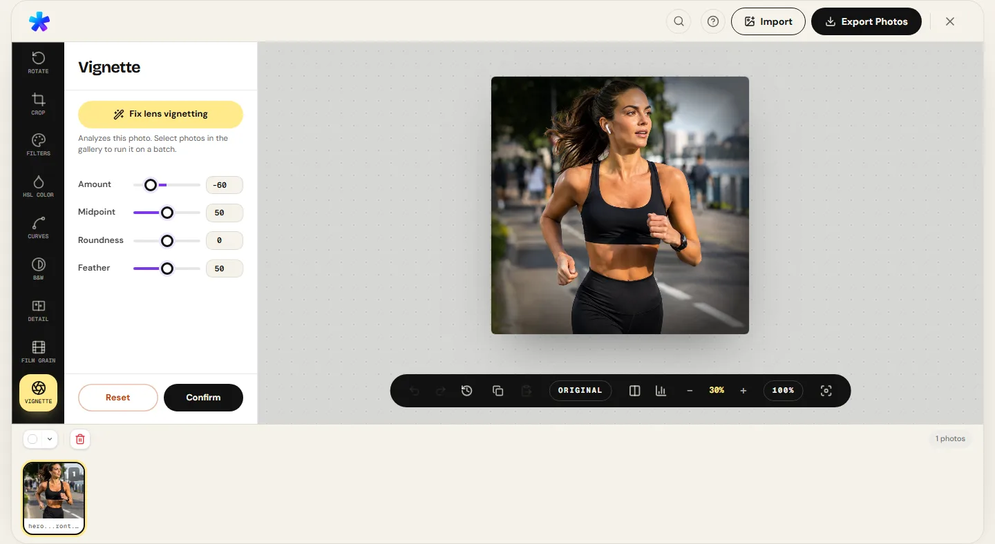
| Peripheral Vignette | Amount −25, Feather 70% | Amount −35, Feather 85% | Amount −45, Feather 60% |
Treat these configurations as dynamic starting points: every capture possesses unique ambient lighting that warrants subtle tailoring. If your source capture is overly contrasty, pair these values with a slight reduction in Clarity.
The optical mechanics of classic manual lenses: flare and soft contrast
Much of the ethereal quality attributed to vintage film photography originates not from the chemical emulsion itself, but from the mechanical manual lenses of the 1950s through 1980s (such as the Helios 44-2 58mm f/2, Pentax Super-Takumar 50mm f/1.4, or vintage Carl Zeiss and Leica Summicron glass).
Unlike contemporary computerized lenses coated in anti-reflective nanocrystal films designed for biting corner-to-corner micro-contrast, vintage optics exhibited celebrated organic imperfections:
- Lower Edge Micro-Contrast: Vintage optical elements allowed subtle veiling flare (*veiling glare*) to wash across the frame, gently softening skin pores and harsh digital transitions.
- Natural Mechanical Vignetting: At wide apertures (such as f/1.4 or f/2), the metal lens barrel physically obstructed oblique peripheral rays, creating a gradual, pleasing falloff of light in the corners.
- Organic Swirling Bokeh: Shallow depth of field produced distinctive, swirling background blur that instinctively pulled viewer focus toward the center of the frame.
In PhotoEditor.sbs, you recreate this optical character by easing off the Clarity slider (which tones down digital micro-contrast halos) and applying a feathered vignette via the Vignette panel.
The four foundational pillars of authentic analog grading
Converting a clean digital capture into a photograph brimming with film-like atmosphere requires mastering four independent aesthetic pillars:
- Tone & Contrast (The Characteristic Toe): Subdue clinical digital contrast and raise the black point by 10% to 15% using the tone curve. Shadows should register as warm charcoal rather than electronic pitch-black.
- Color Palette & Color Cast: Genuine color film was rarely neutral. Most historic negative stocks exhibited warm amber biases in the midtones and subtle cyan/blue infusions across shadows. Dial down global saturation and use the HSL panel to refine foliage greens and skies.
- Organic Texture (Monochromatic Grain): Introduce moderate structural grain. On modern high-DPI displays (such as MacBook Retina screens or smartphones), a grain amount between 25 and 40 imparts texture without smudging facial contours.
- Optical Edge Falloff (Soft Vignette): Apply an organic, heavily feathered edge vignette to gently direct visual interest inward, replicating vintage prime lens barrel shading.
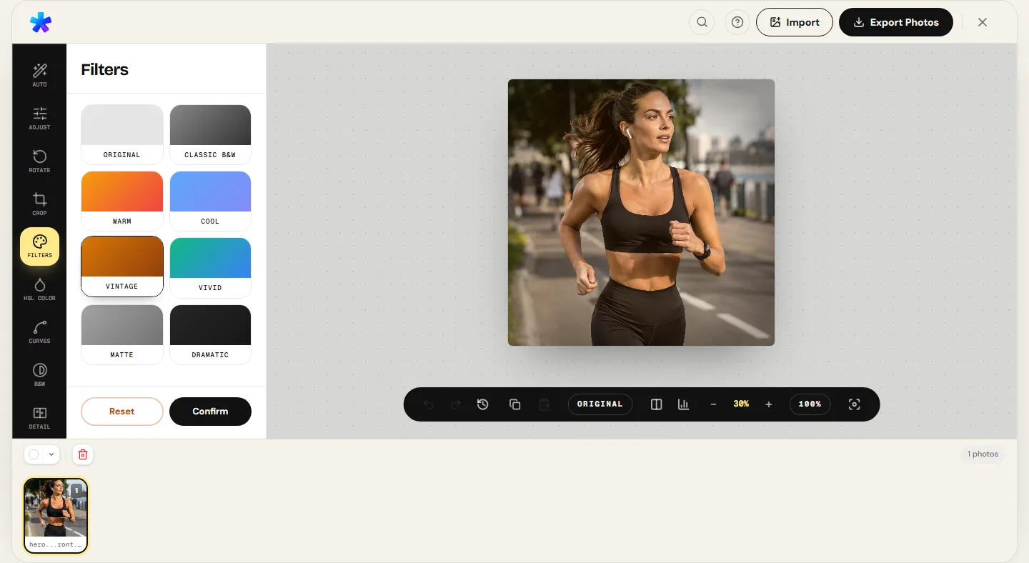
Step-by-step PhotoEditor.sbs workflow: from tonal curve to fine grain
Follow this step-by-step workflow to build an authentic film aesthetic using PhotoEditor.sbs's modular tool panels:
- Quick Baseline with the Vintage Preset: Open your photo in PhotoEditor.sbs and open the Filters panel. Select the Vintage card. This instantly pre-populates the editor controls with calibrated baselines: Temperature (+25), Saturation (−20), Contrast (−10), Clarity (−10), Vignette (−30), and Grain (30). Because all sliders remain completely unlocked, you maintain total creative freedom.
- Lift the Shadows in the Curves Panel: Head to the Curves & Levels panel. On the composite RGB curve graph, grab the lower-left anchor point (starting at 0, 0) and drag it vertically upward until the output value reaches approximately 20 to 28. Notice how shadows instantly transform into velvety, matte tones.
- Soft Highlight Compression: On the same curve graph, click the upper-right anchor (255, 255) and gently pull it down to roughly 242 to 245. This prevents highlights from clipping harshly, emulating the shoulder roll-off of traditional film stocks.
- Calibrate Film Grain at 100% Zoom: Open the Grain panel and click the 100% zoom button in the lower toolbar to evaluate your texture at 1:1 pixel scale. If you intend to post on social feeds like Instagram, dial the grain amount up to 35 or 45 so it survives compression downsampling.
- Shape a Feathered Vignette: In the Vignette panel, set the Amount to approximately −25 to −35. Expand the Feather slider so the transition between darkened borders and the focal center is completely imperceptible to the naked eye.
- Inspect with the Split Before/After Tool: Drag the before/after slider across the canvas to verify that your grade feels organic and atmospheric rather than gimmicky.
Importing 3D LUT (.cube) color profiles client-side in the browser
For colorists seeking exact emulations of specific chemical film stocks developed in professional grading laboratories, PhotoEditor.sbs natively supports 3D LUT files in industry-standard .cube format.
A 3D Look-Up Table is a spatial color matrix mapping input RGB coordinates to output color coordinates with mathematical precision:
- PhotoEditor.sbs processes 3D tables up to 65 grid points per axis directly inside browser Web Workers;
- Loaded
.cubefiles persist securely inside your browser's local IndexedDB cache, remaining available across future editing sessions without ever uploading files to cloud servers; - You can smoothly blend the LUT Opacity from 0% to 100% to achieve the exact right intensity of color grading;
- Imported LUTs operate seamlessly alongside other tools: load a custom Kodak Portra table and complement it with native grain, tone curves, and vignette tools.
Classic rookie blunders that expose a fake film effect
Avoid these telltale pitfalls that instantly betray an amateur film grade:
- Coarse, Oversized Grain: Pushing the grain scale too high turns an image into a noisy, pixelated mess. Authentic 35mm grain (particularly on ISO 100 and 400 stocks) is fine, cohesive, and tightly packed.
- Excessively Washed-Out Shadows: Raising the curve black point beyond 40 causes images to look hazy or accidental. True film retains punchy, rich contrast in the lower midtones.
- Hard-Edged Circular Vignettes: Vignettes with sharp transitions look like bad digital overlays. Authentic vintage lens falloff is soft and feather-light.
- Neglecting Base Exposure: Attempting to grade underexposed or poorly lit captures will not miraculously impart film charm. Balance basic light and exposure before applying vintage stylization.
Frequently asked questions
Does PhotoEditor.sbs offer light leaks or simulated dust overlays?
No. PhotoEditor.sbs does not generate artificial burn overlays, scratch masks, or dust textures. Our platform focuses on authentic photographic color science: characteristic curve response, HSL balance, monochromatic grain, and professional 3D .cube LUT mapping.
What is the difference between using the Vintage preset vs. manual grading?
The Vintage preset serves as an instant accelerator that pre-populates recommended parameters across temperature, contrast, vignette, and grain. Manual grading allows you to shape the Hurter & Driffield curve specifically to the unique lighting of your capture.
Why does film grain sometimes disappear when posted to Instagram?
Meta's compression algorithms interpret high-frequency pixel variations as noise and apply smoothing. To preserve grain texture on social feeds, export in high quality (JPEG 90%) and apply slightly more grain than appears necessary on desktop monitors.
Can I apply analog film grading to smartphone photos?
Absolutely. Smartphone captures often benefit the most: they typically ship with aggressive computational sharpening and saturated contrast. Analog grading restores soft, organic depth to clinical mobile sensors.
What is a .cube LUT and where can I find film stock profiles?
A .cube LUT is a standard 3D lookup table used in cinematography and photography to map color values. You can load any .cube file up to 65 grid points into PhotoEditor.sbs via the Filters panel.
Does the editor's film grain create colored chroma noise?
No. PhotoEditor.sbs utilizes a strictly monochromatic stochastic algorithm that modulates only luminance intensity, ensuring zero unwanted chromatic artifacts.
How can I save my custom film recipe to use across other photos?
After crafting your grade, save it under the Auto panel as a 'My Recipe' entry, or simply copy your settings with Ctrl+C and paste them onto subsequent images with Ctrl+V.
Which format should I select when exporting film-styled photos?
For social sharing and general web viewing, export to JPEG at 90% quality. For self-hosted websites, exporting to WEBP (when the browser supports it) delivers compact file sizes with crisp grain reproduction.